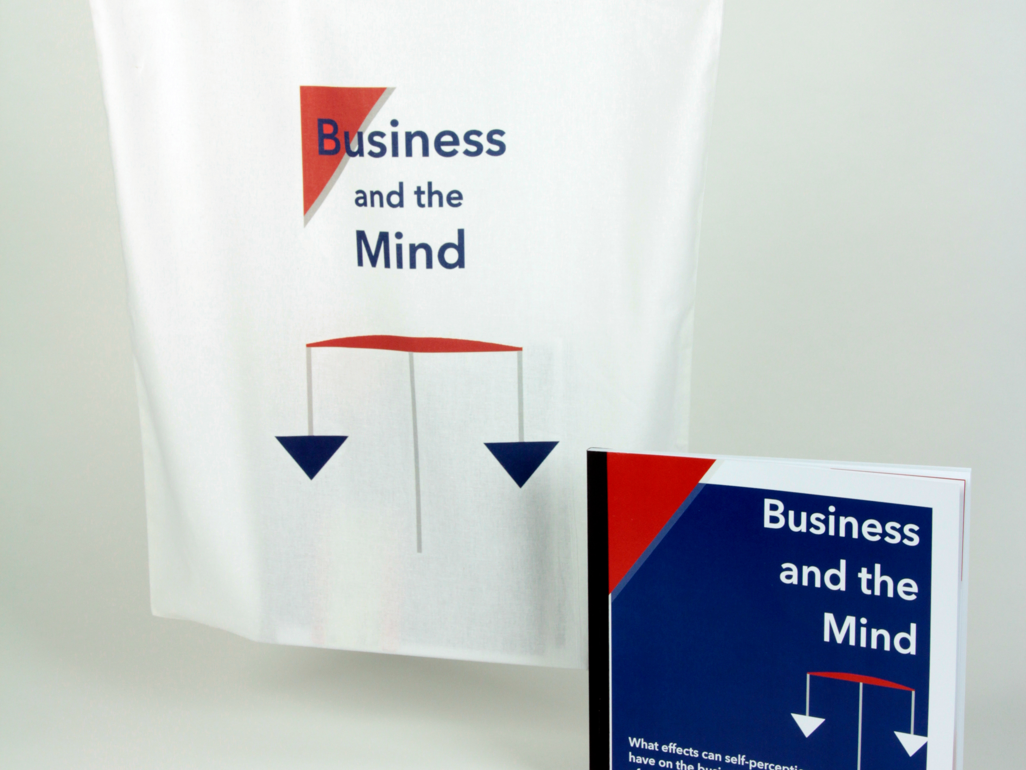
In 2016 I joined the Make a Difference team of four as their Graphic Designer. I designed promotional material, social media graphics, presentations, assisted in copy writing, promoting, organising and speaking at events.
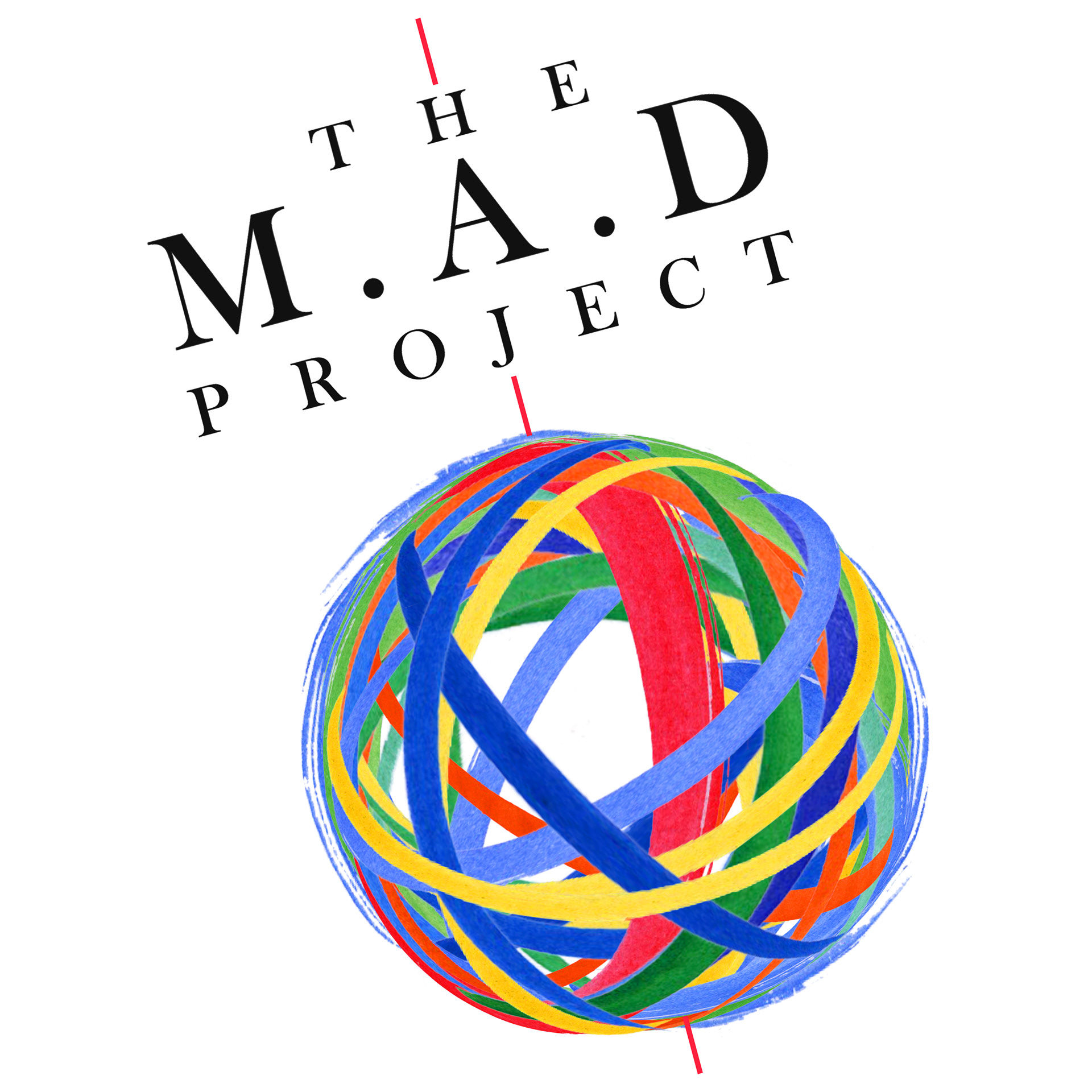
In 2016, I proposed a brand re-design of logo, typefaces and colour scheme. The M.A.D. project is a socially driven company, focused on raising awareness of artistic movements that are encouraging change to on going oppression worldwide. Conceptually addressing the redevelopment, I considered the importance of people and collective action to achieving change.
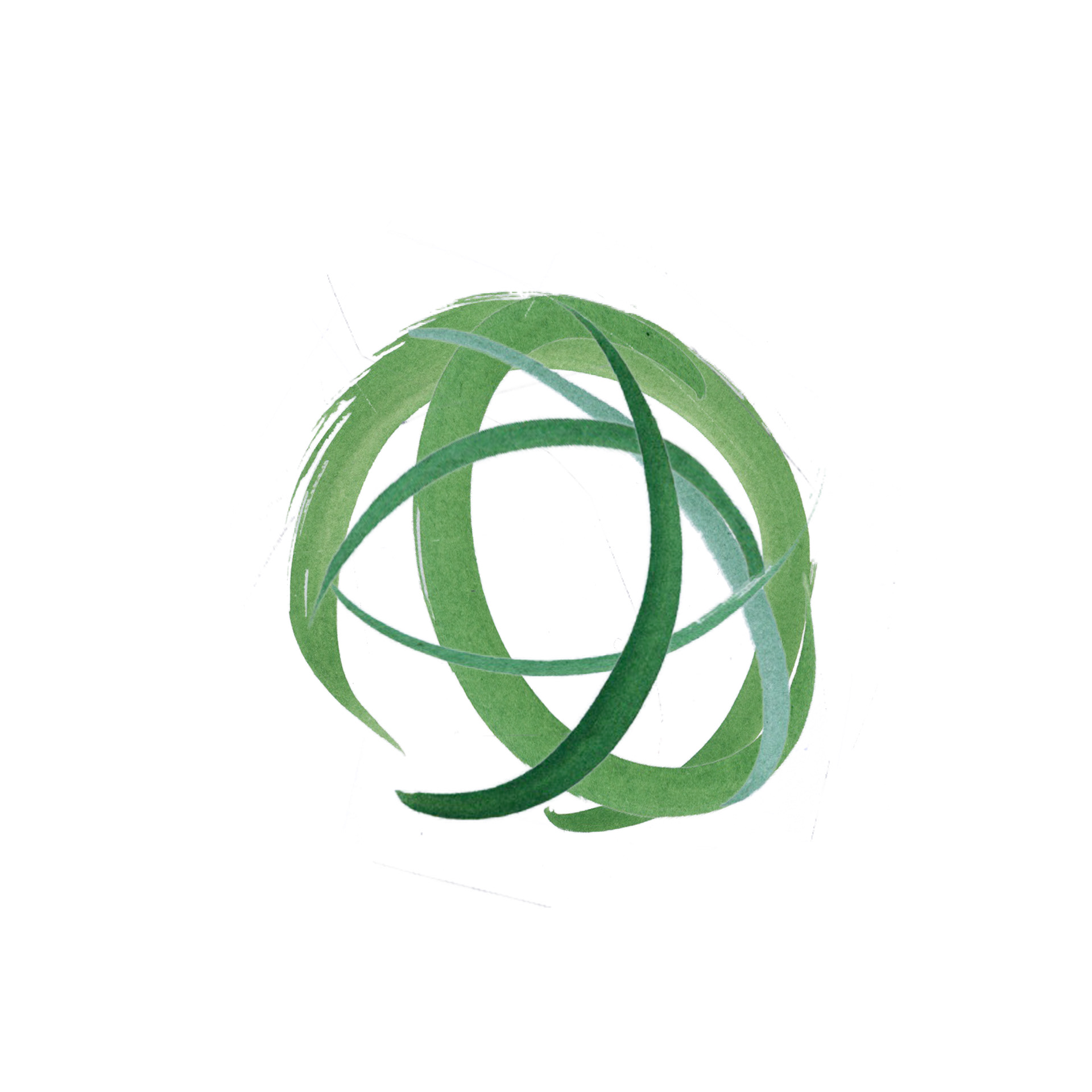
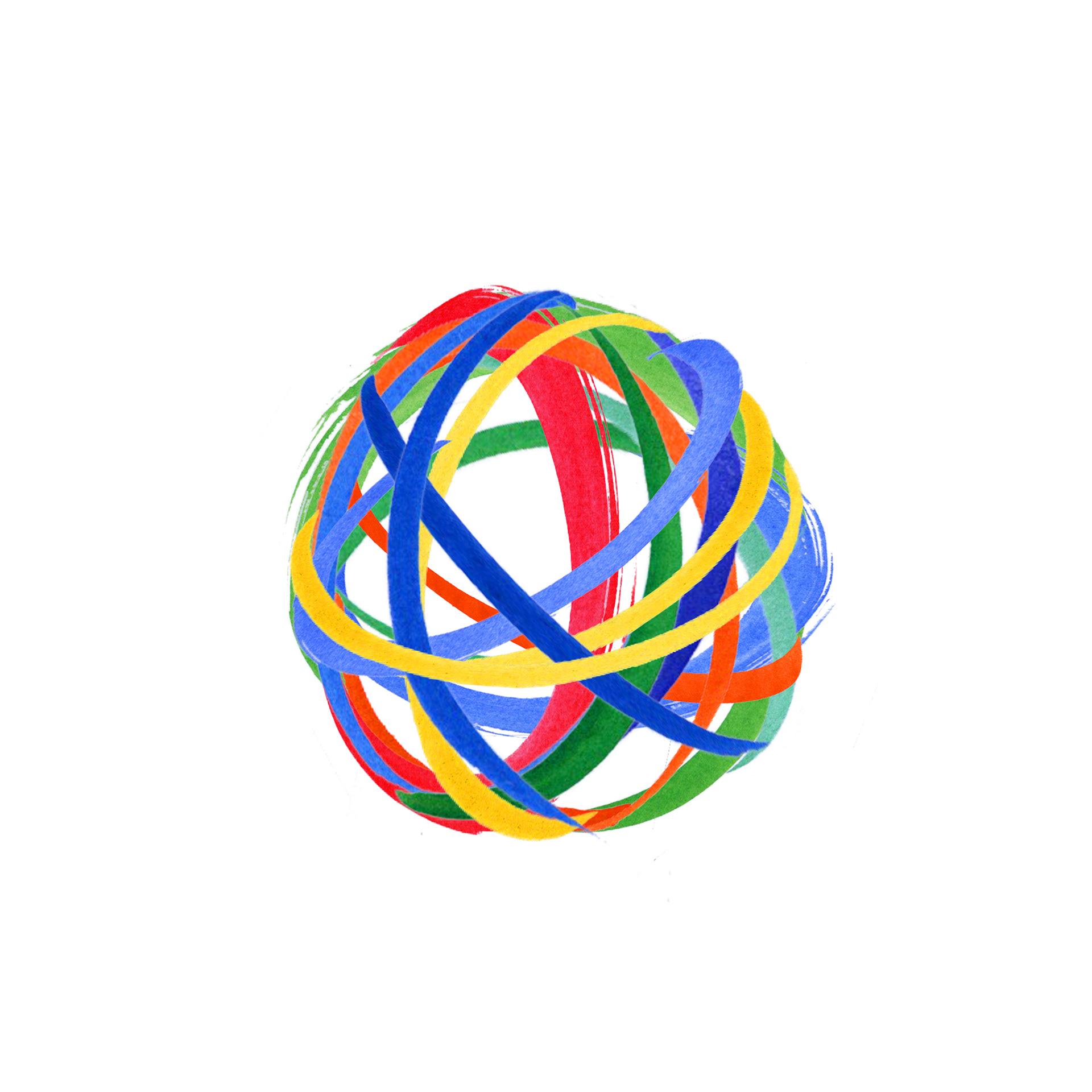
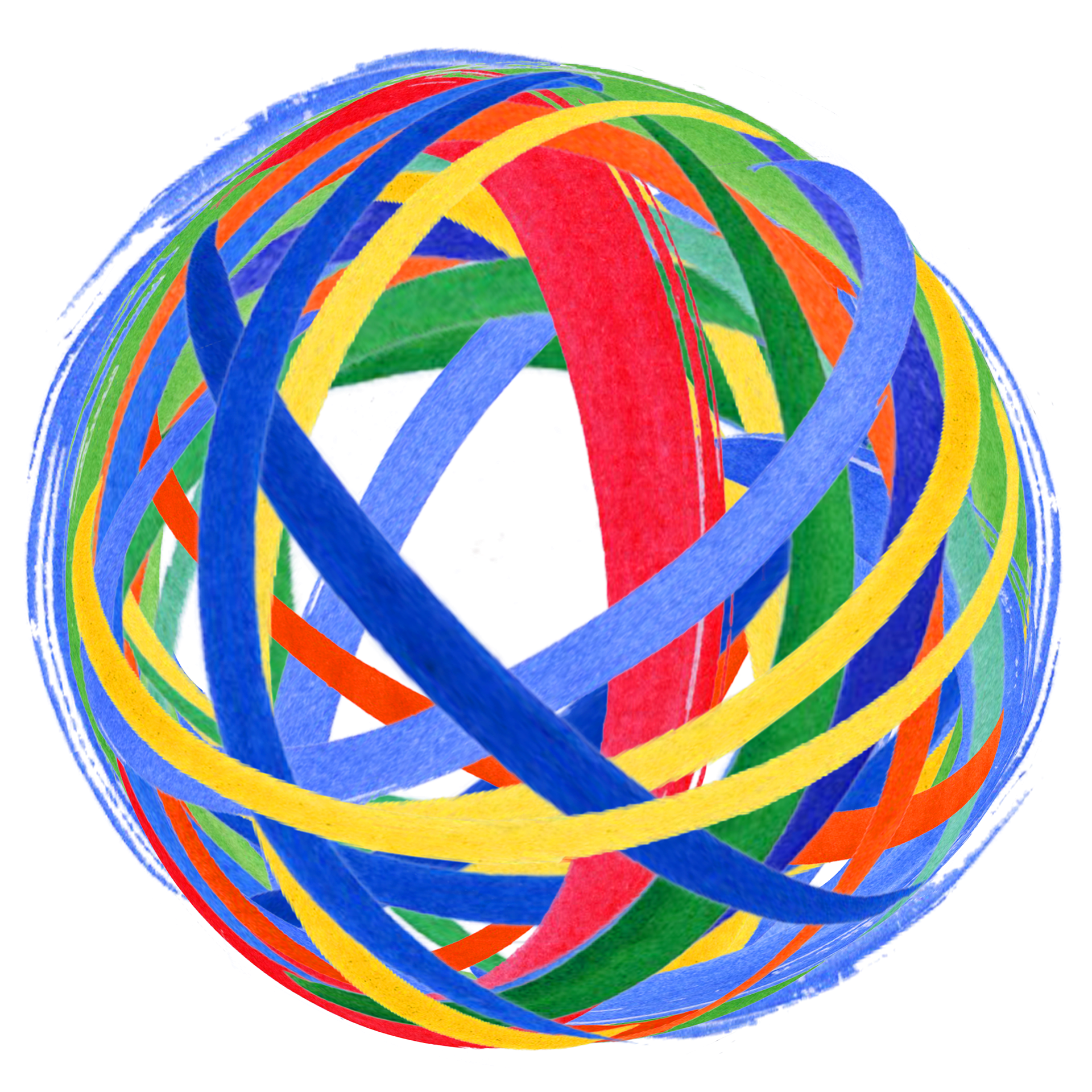
Integrating the pros of the original logo, I converted the representation of the coloured circles, to a colourful rubber band ball. An everyday, recognisable object signifying connectivity, durability, strength and flexibility. Whilst, primarily signifying the importance of each rubber band, in the creation of a whole. Representative of the necessity of united, individual contributions to achieving universal objectives.
Process:
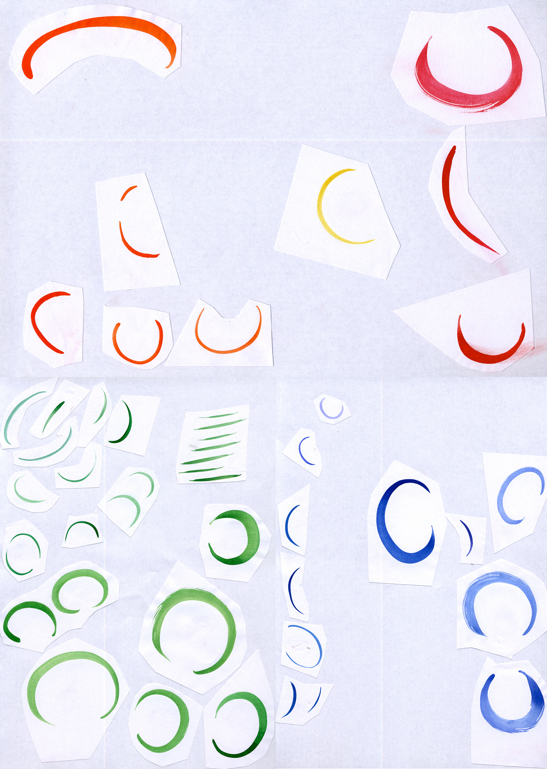
To echo the project’s connection to the arts, I painted each ‘band’ in watercolour, and combined them a whole, spherical shape in Adobe Photoshop. Lifting and releasing the logo into a kinetic, three dimensional space. Multiple colours representing inclusivity, variety and diversity of the people and issues addressed by the project.
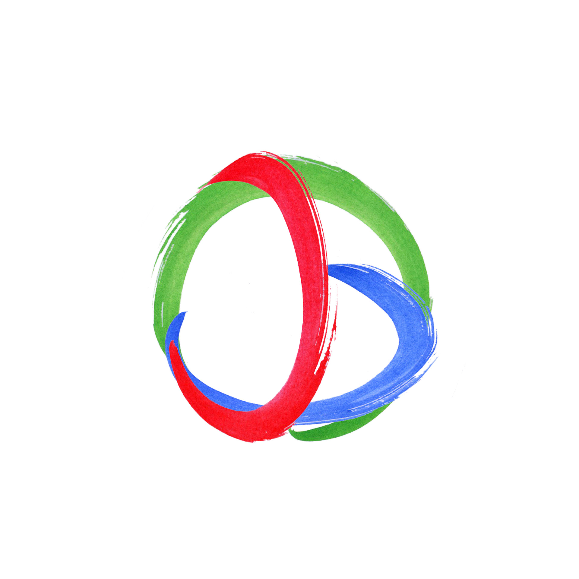
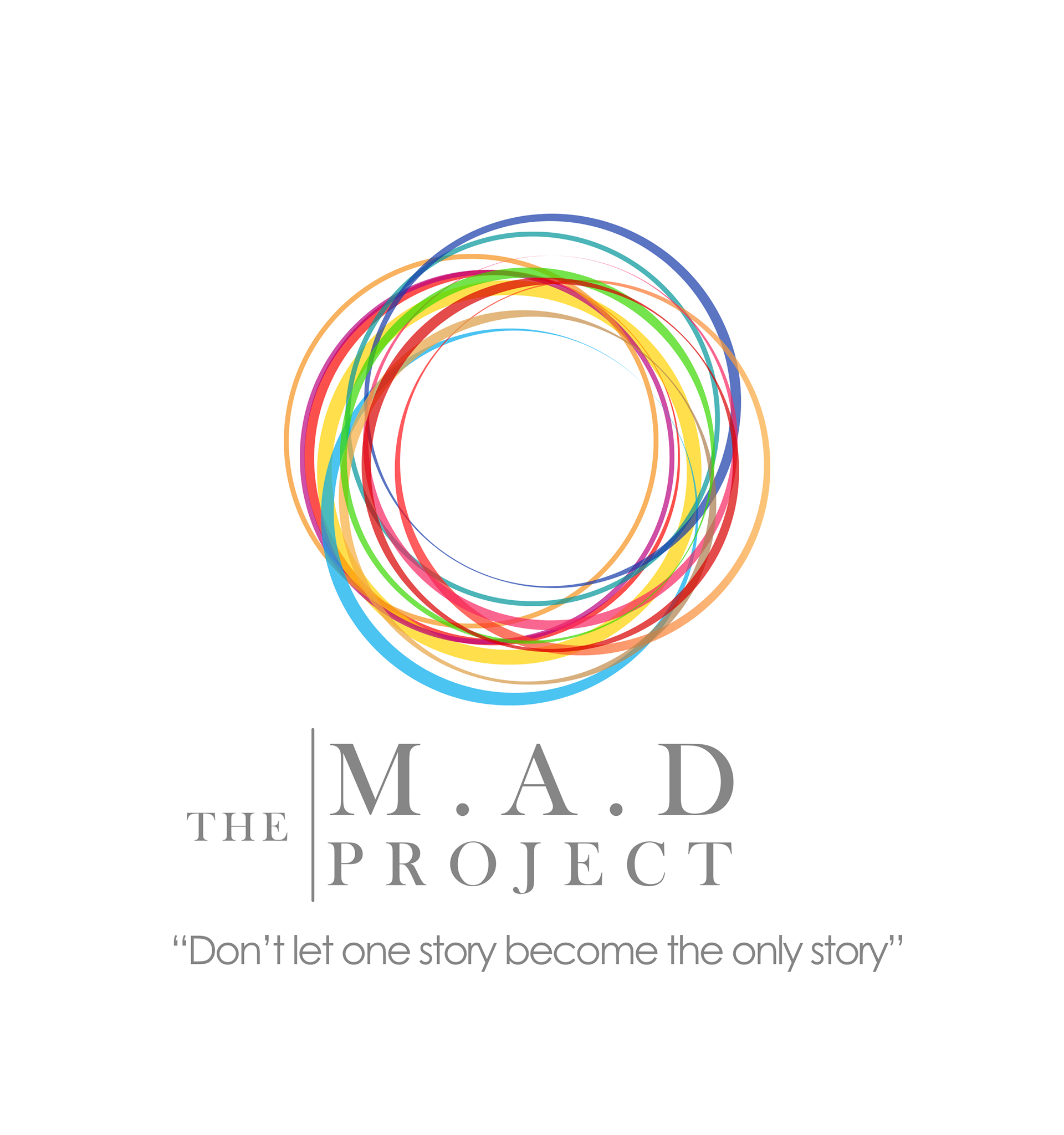
(Original logo below, right)
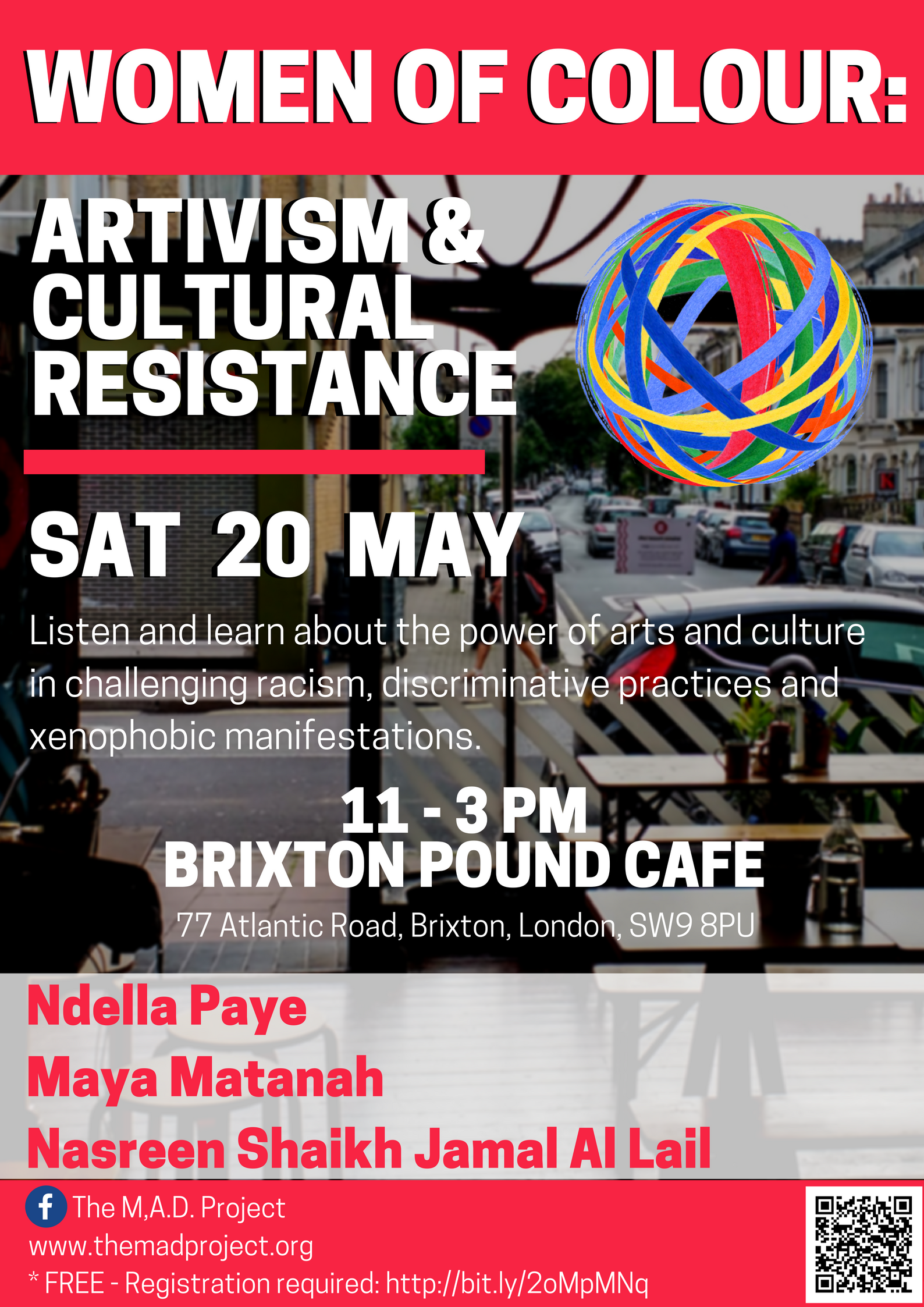
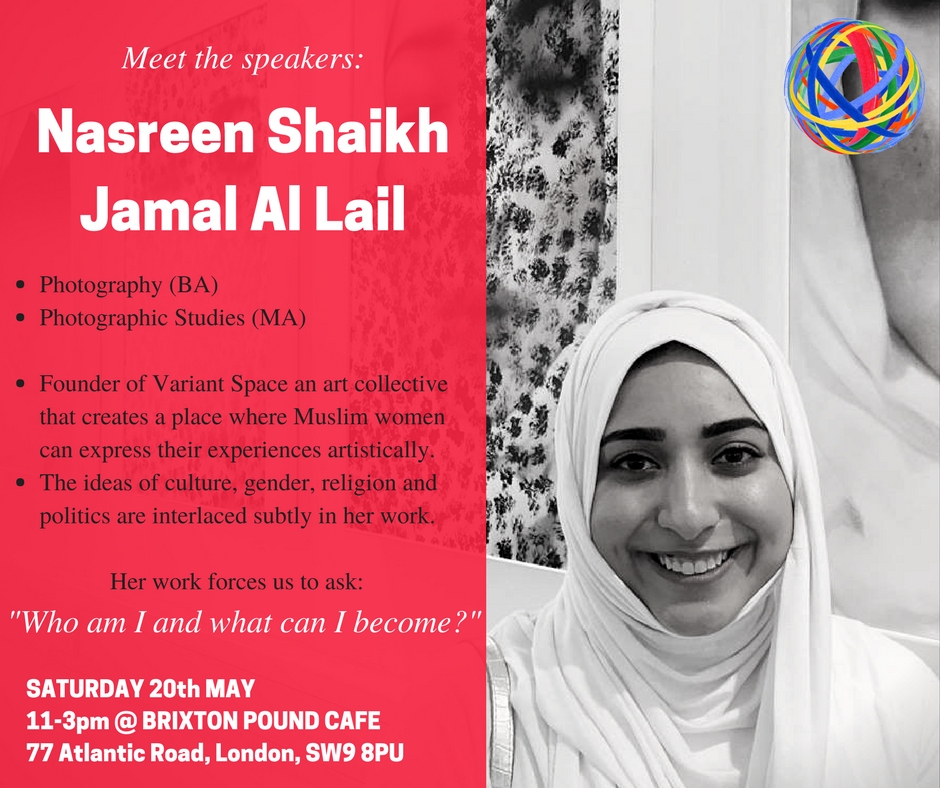
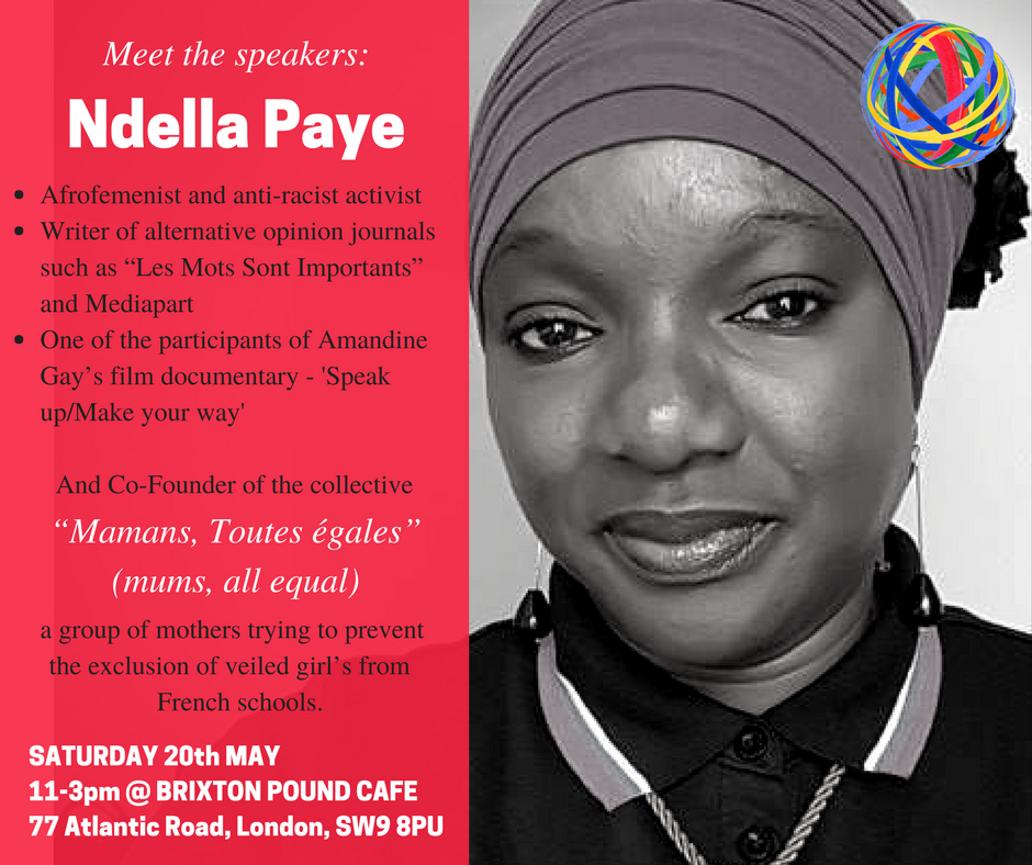
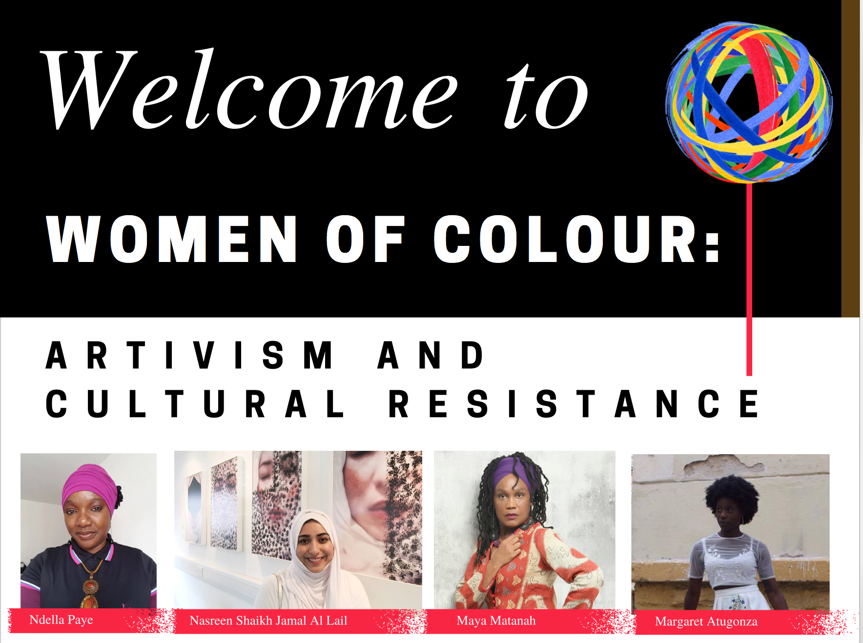
Promotional Graphic Design
Poster
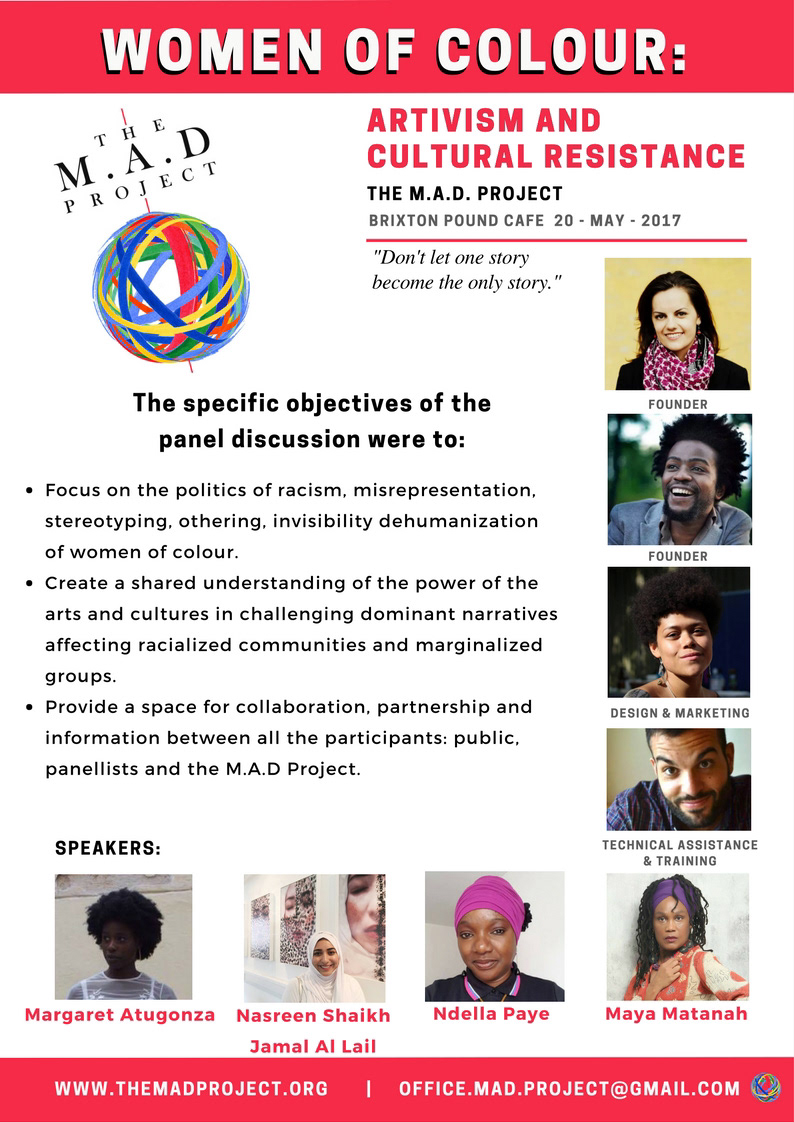
Leaflet
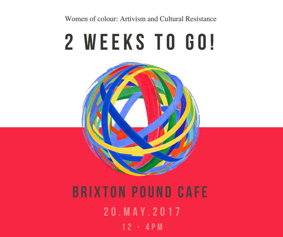
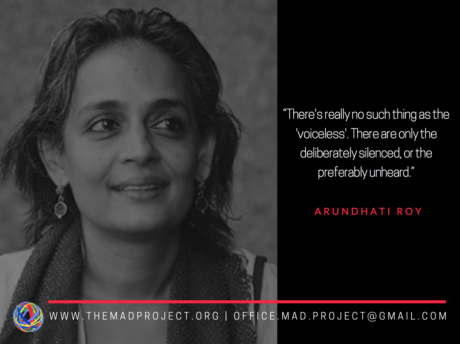
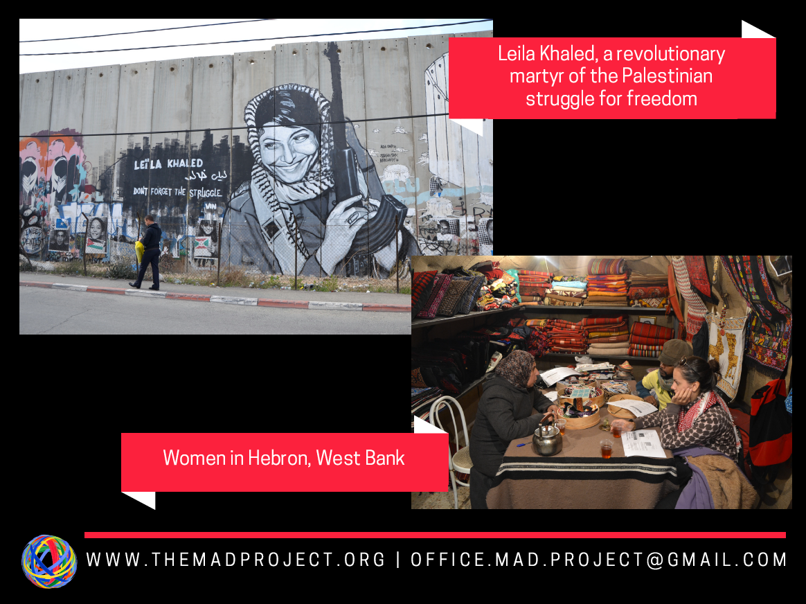
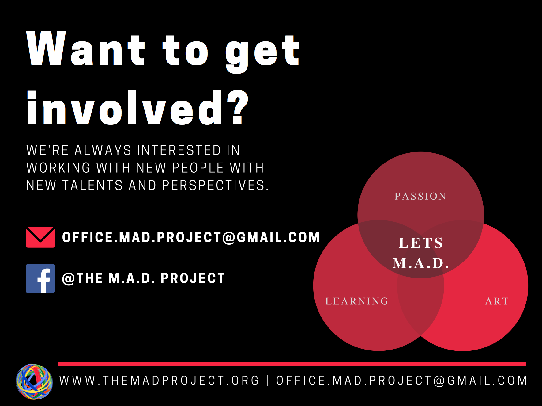
Social media graphics
Powerpoint presentation
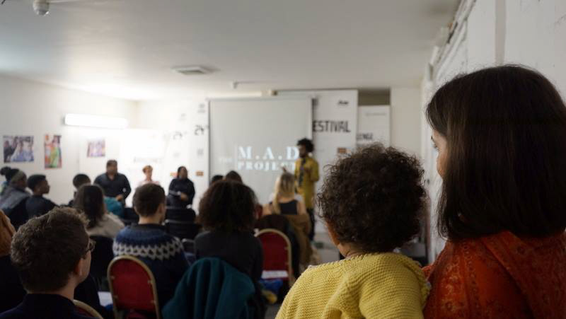
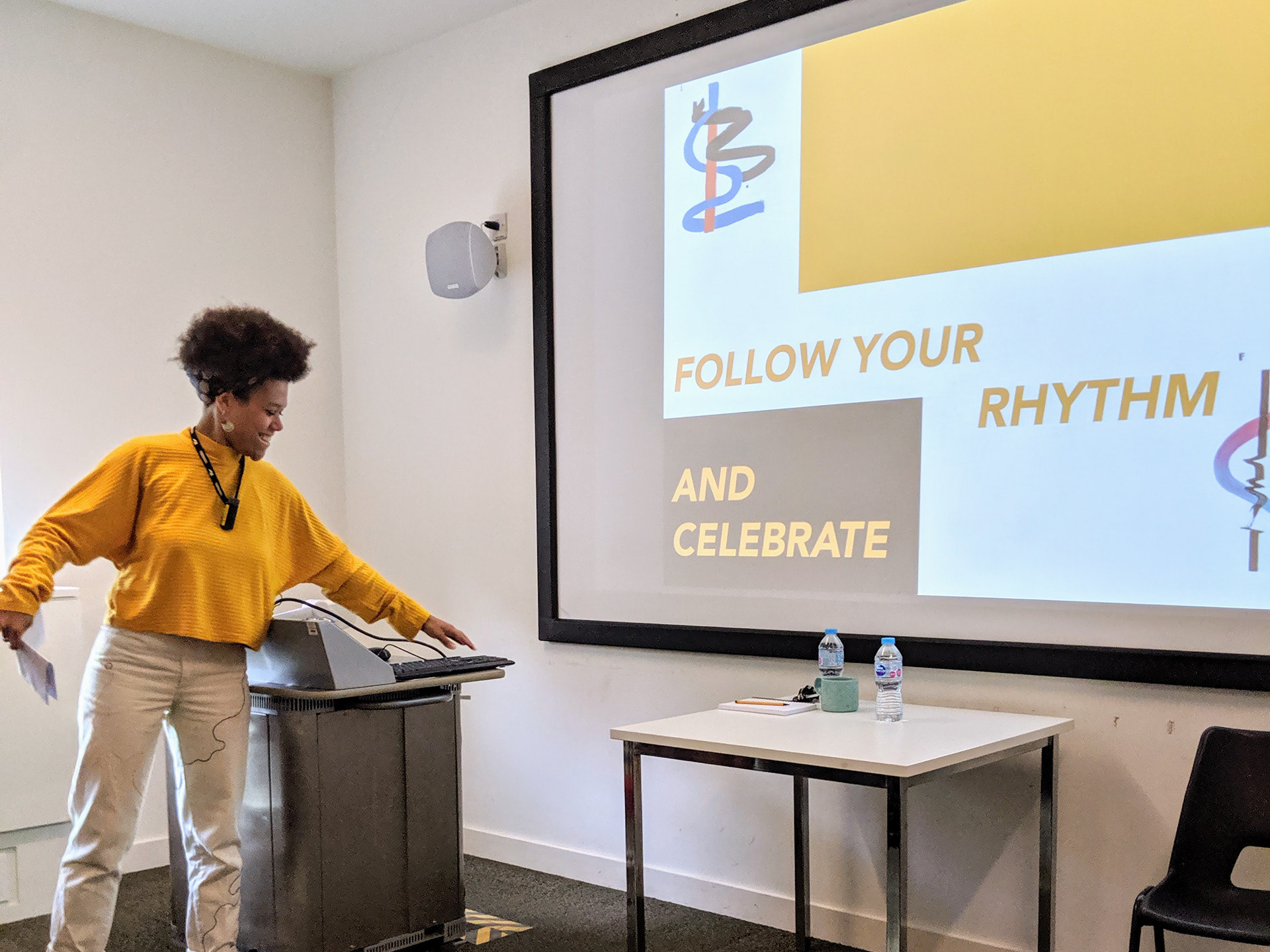
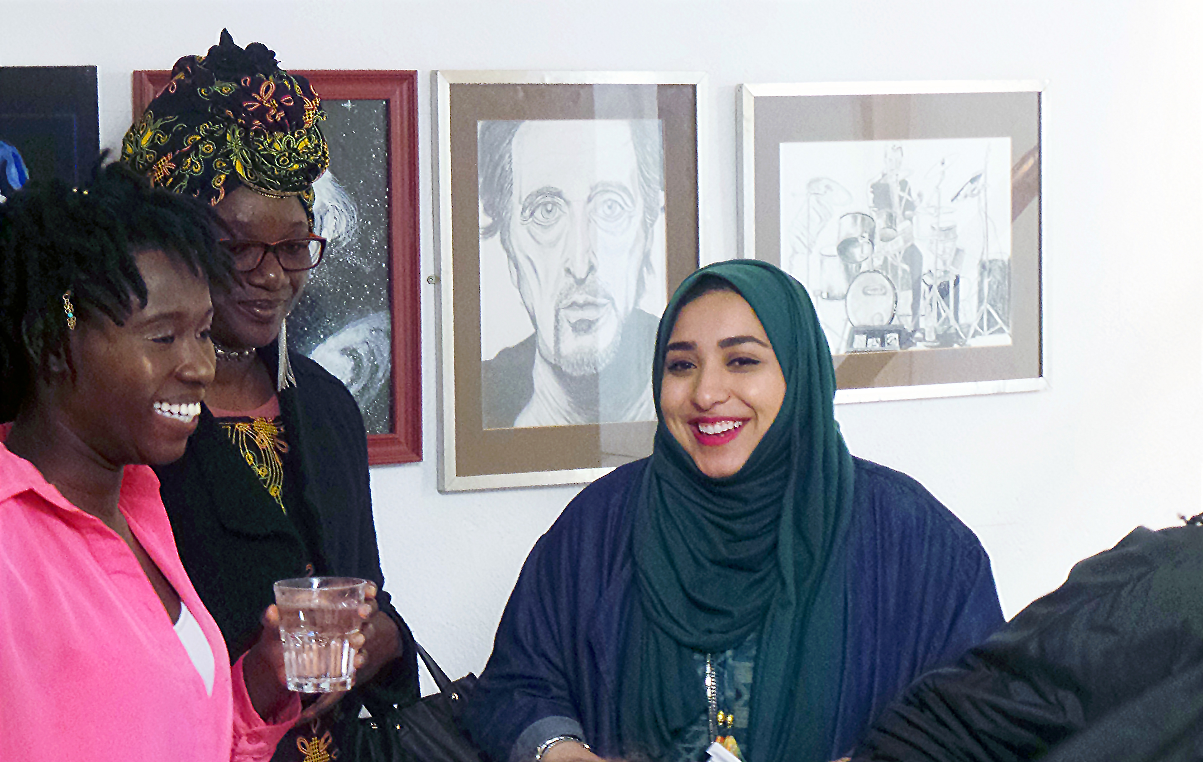
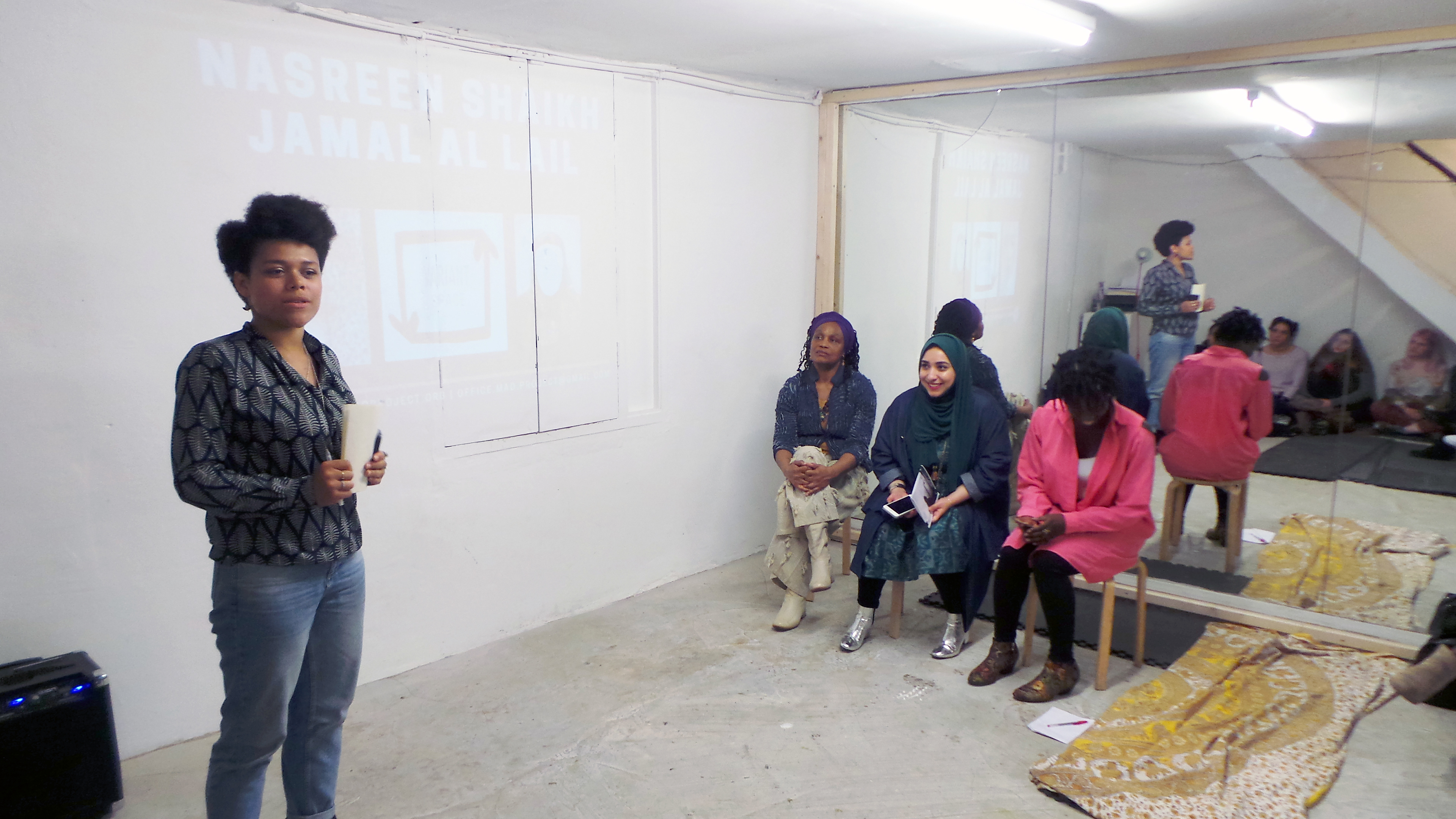
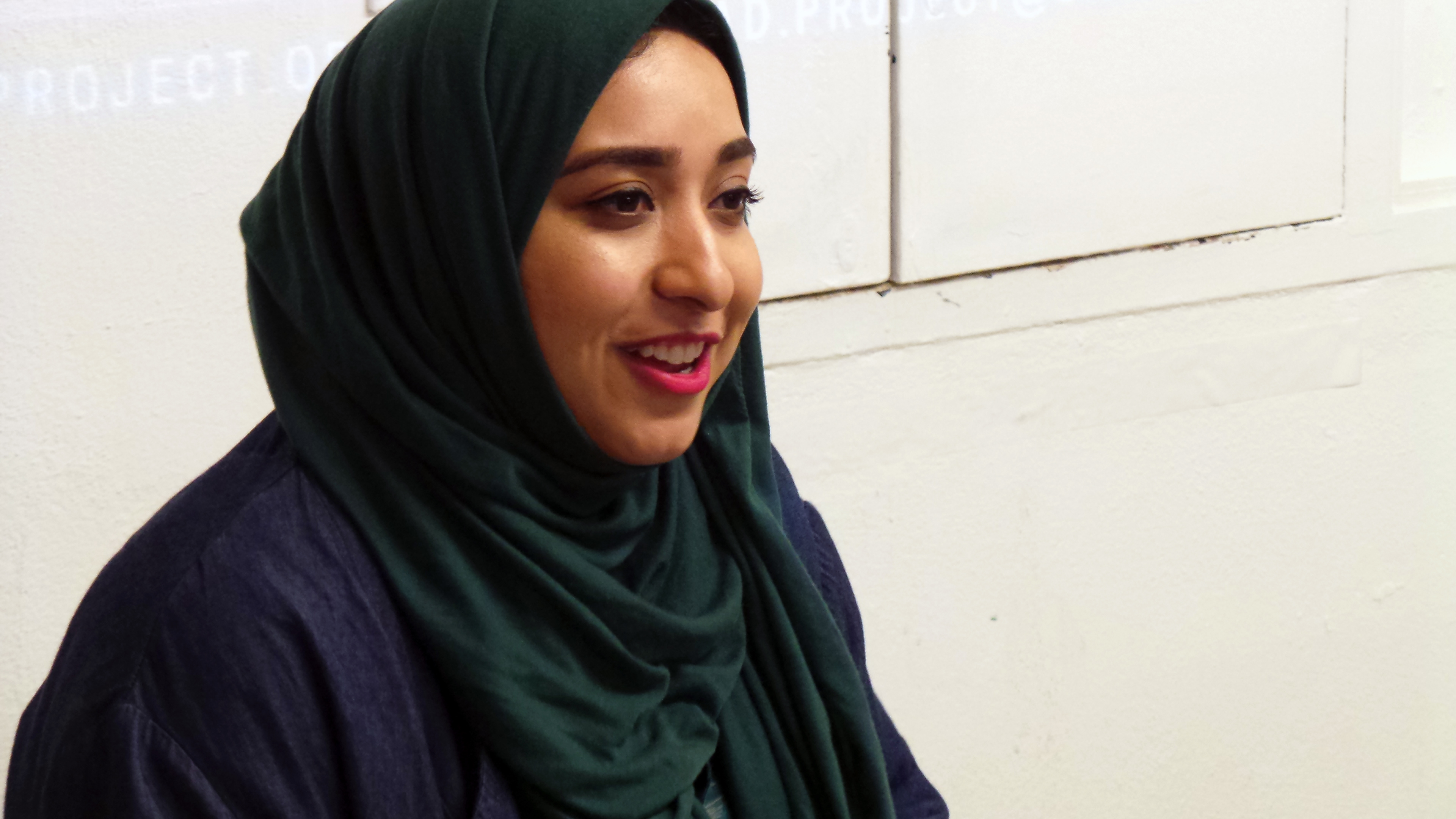
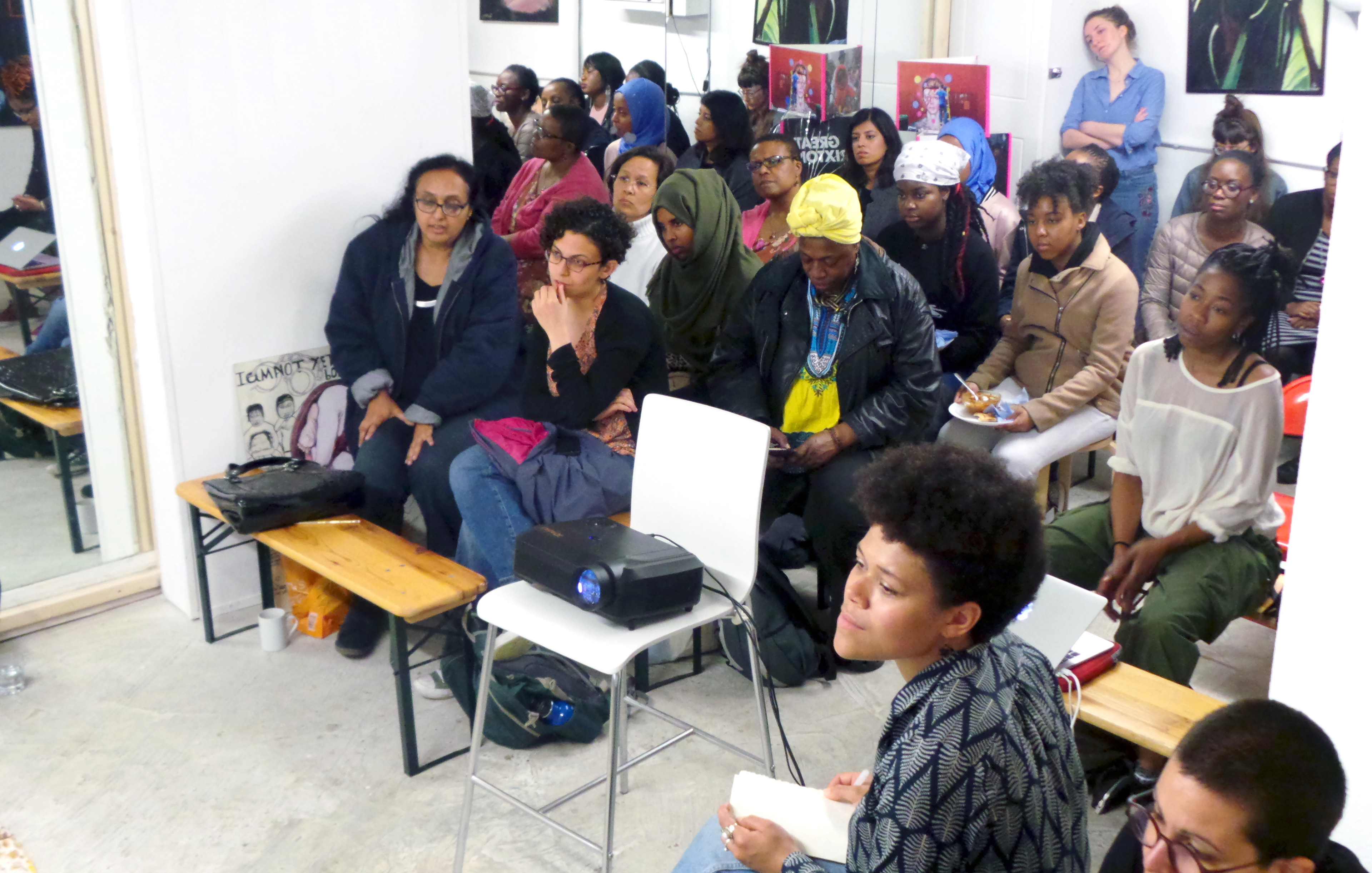
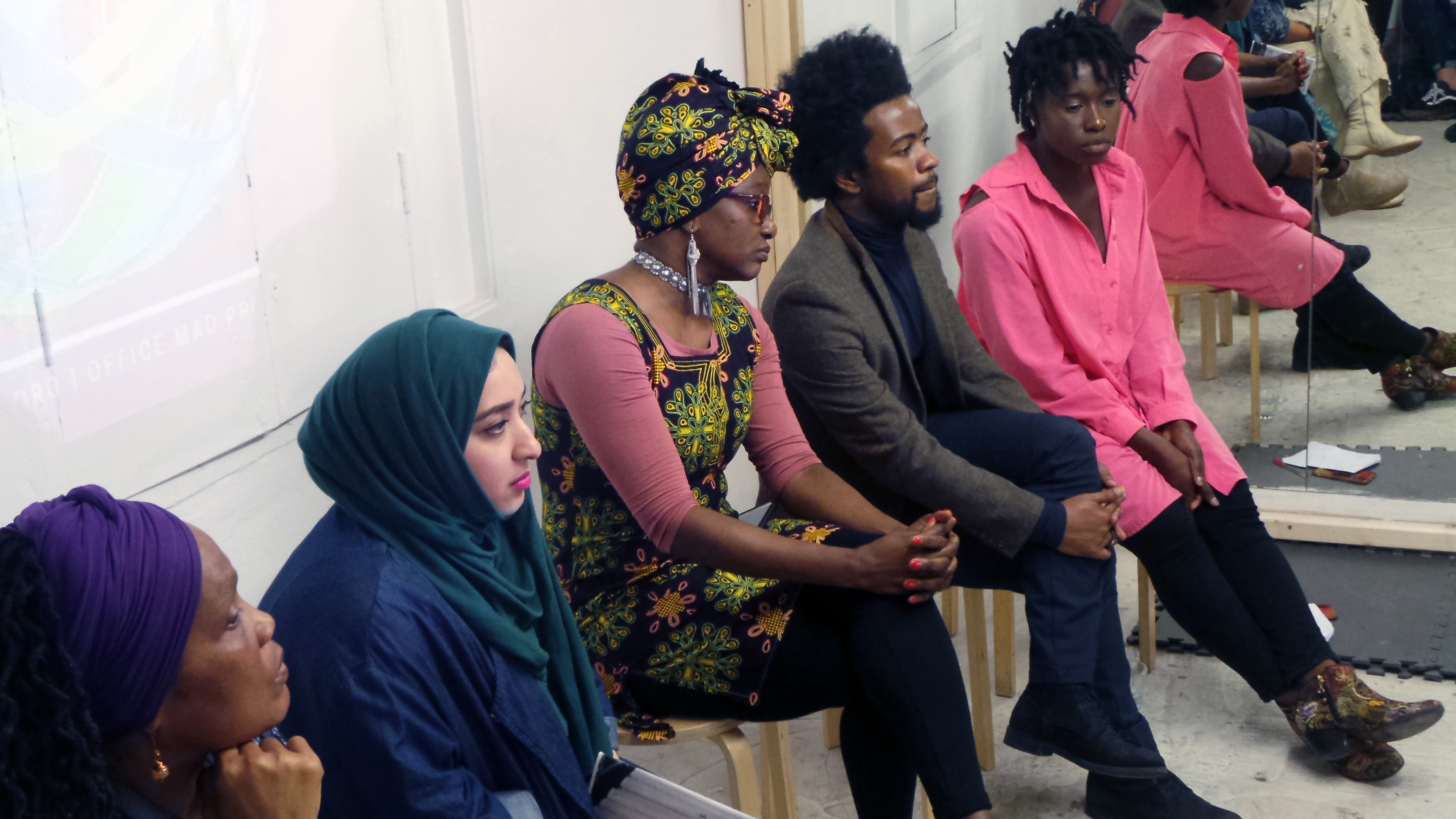
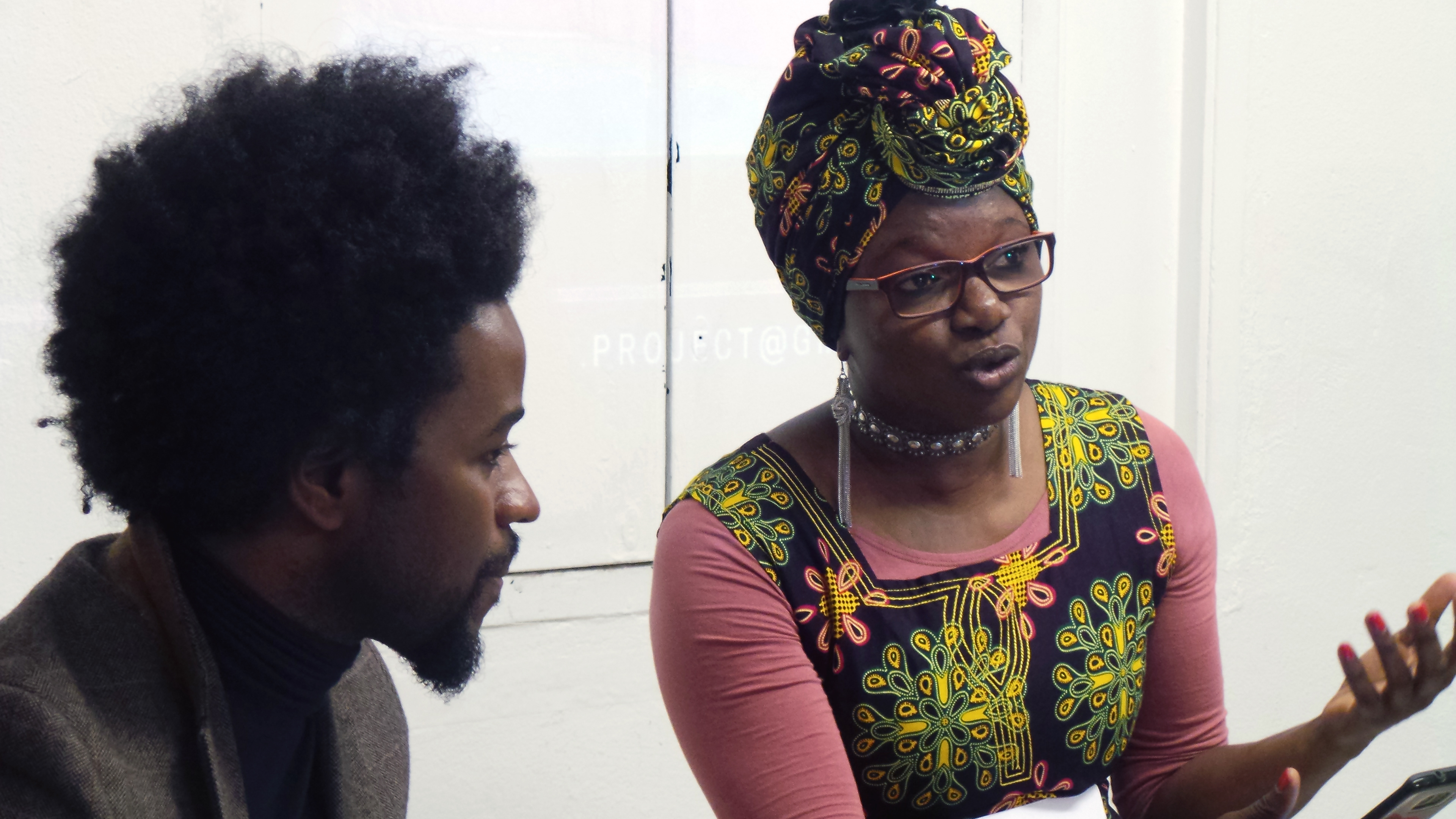
Photographs from second event, May 2016
Taken by Sergio Merenda
Taken by Sergio Merenda
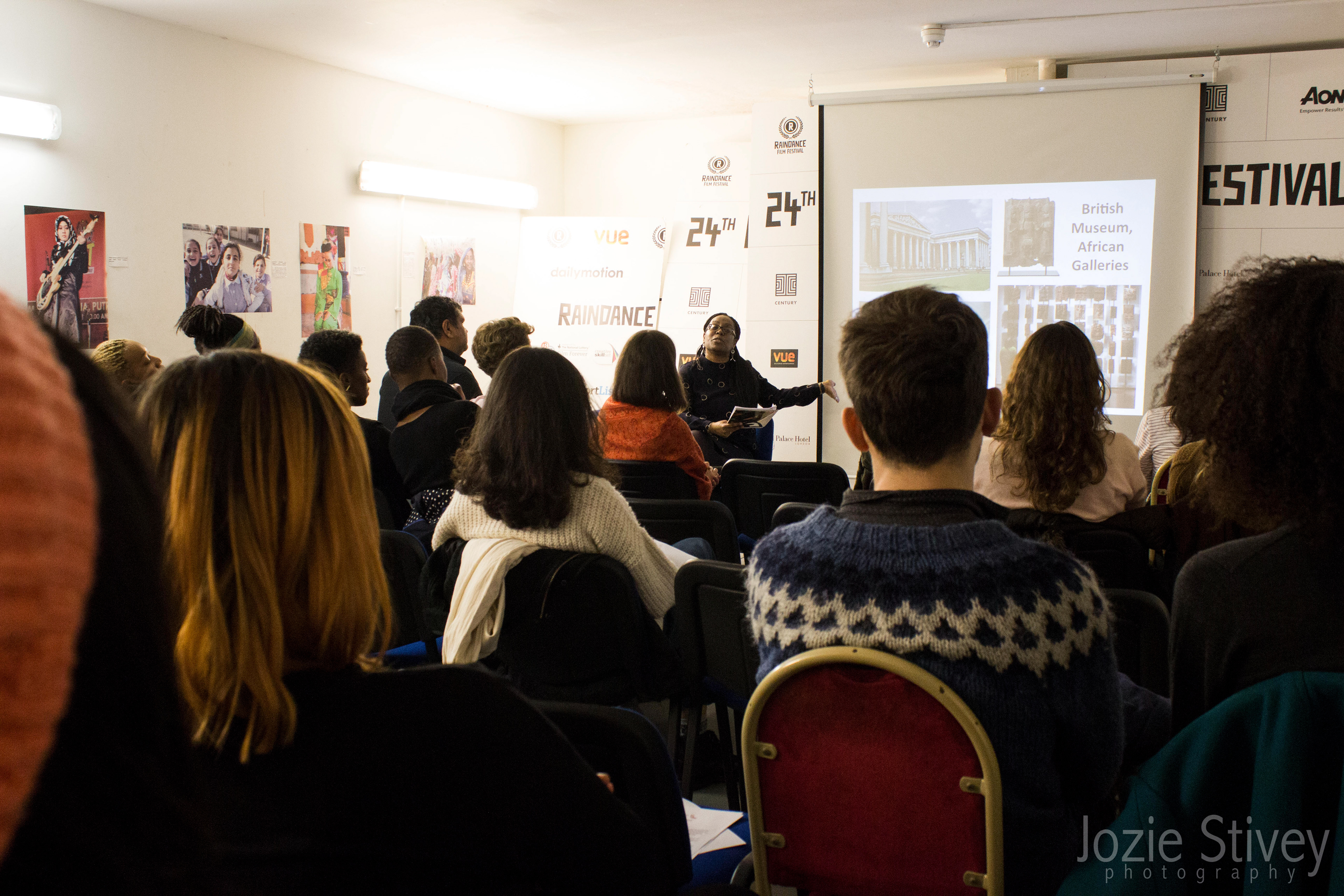
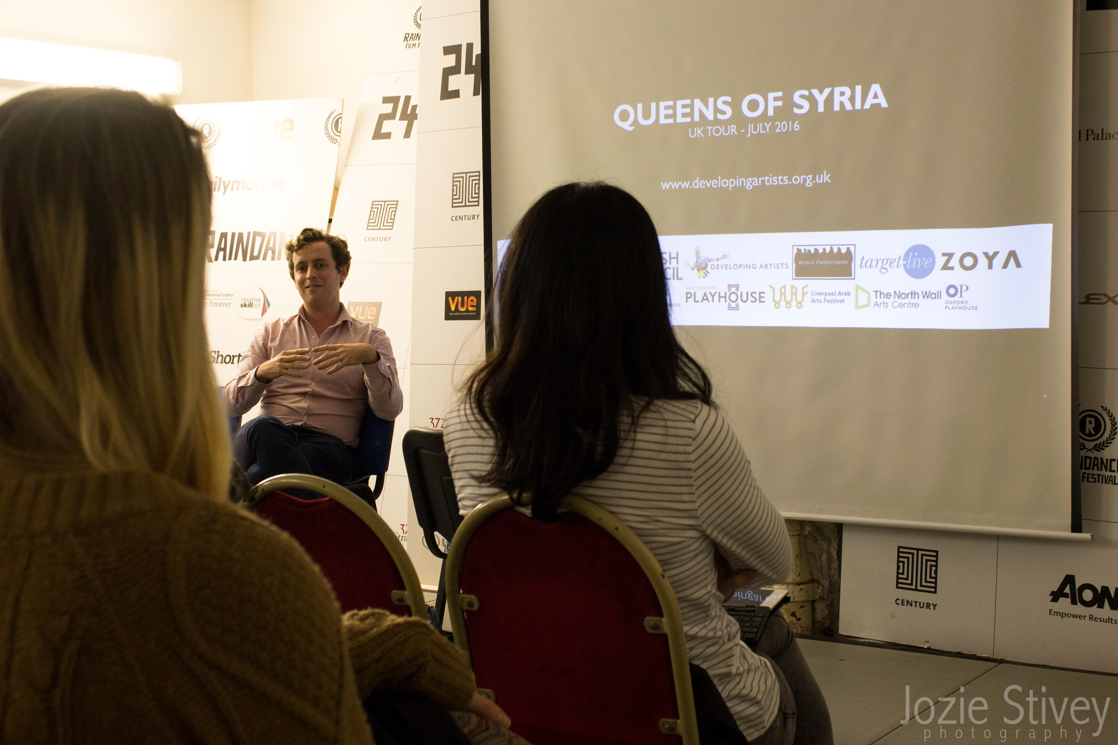
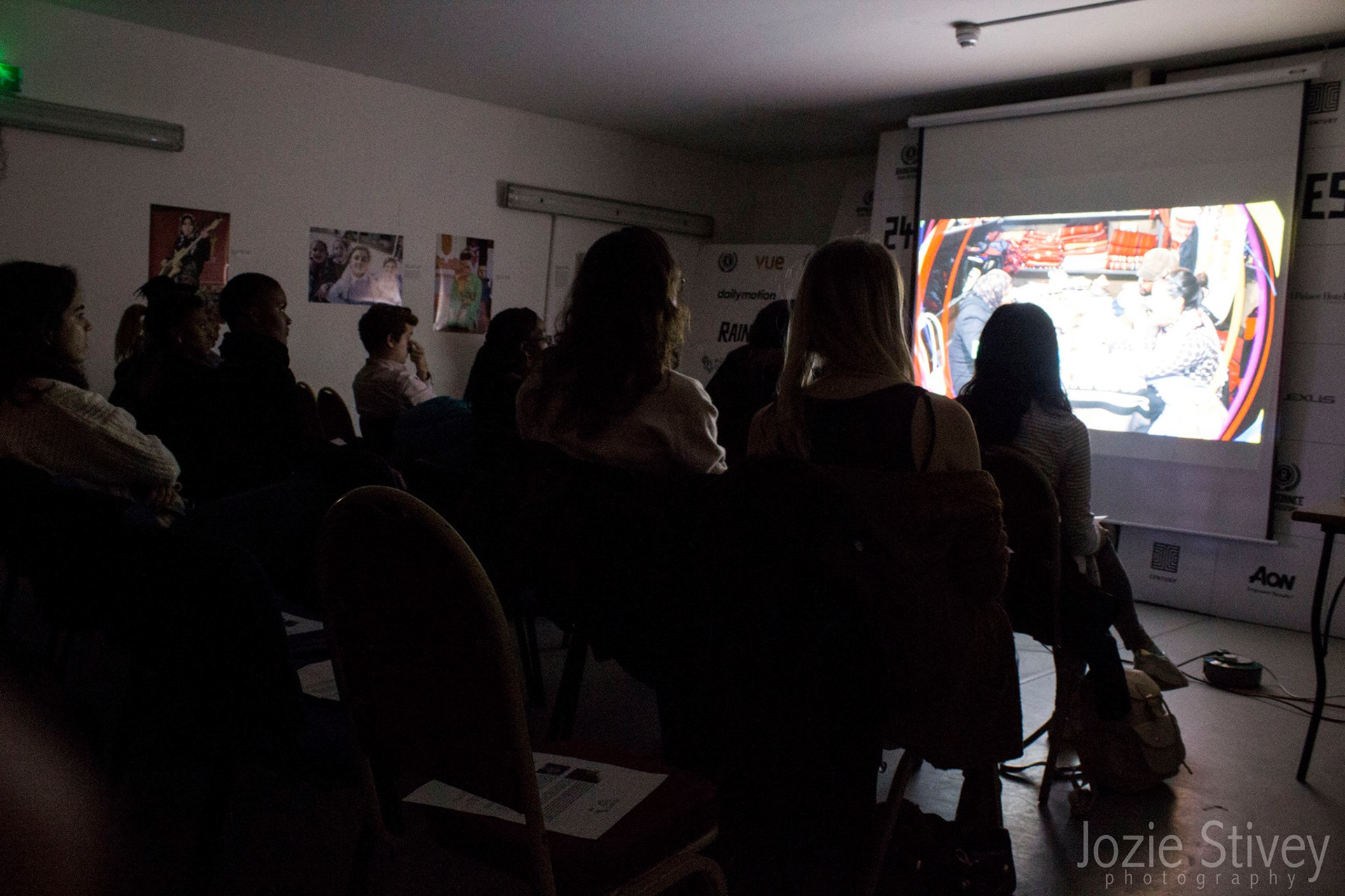
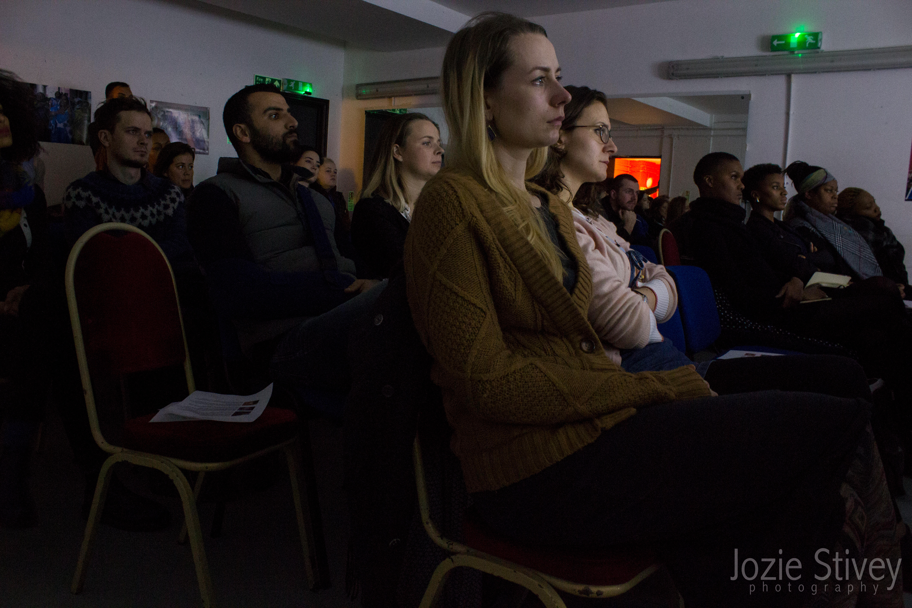
Photographs from first event, December 2015
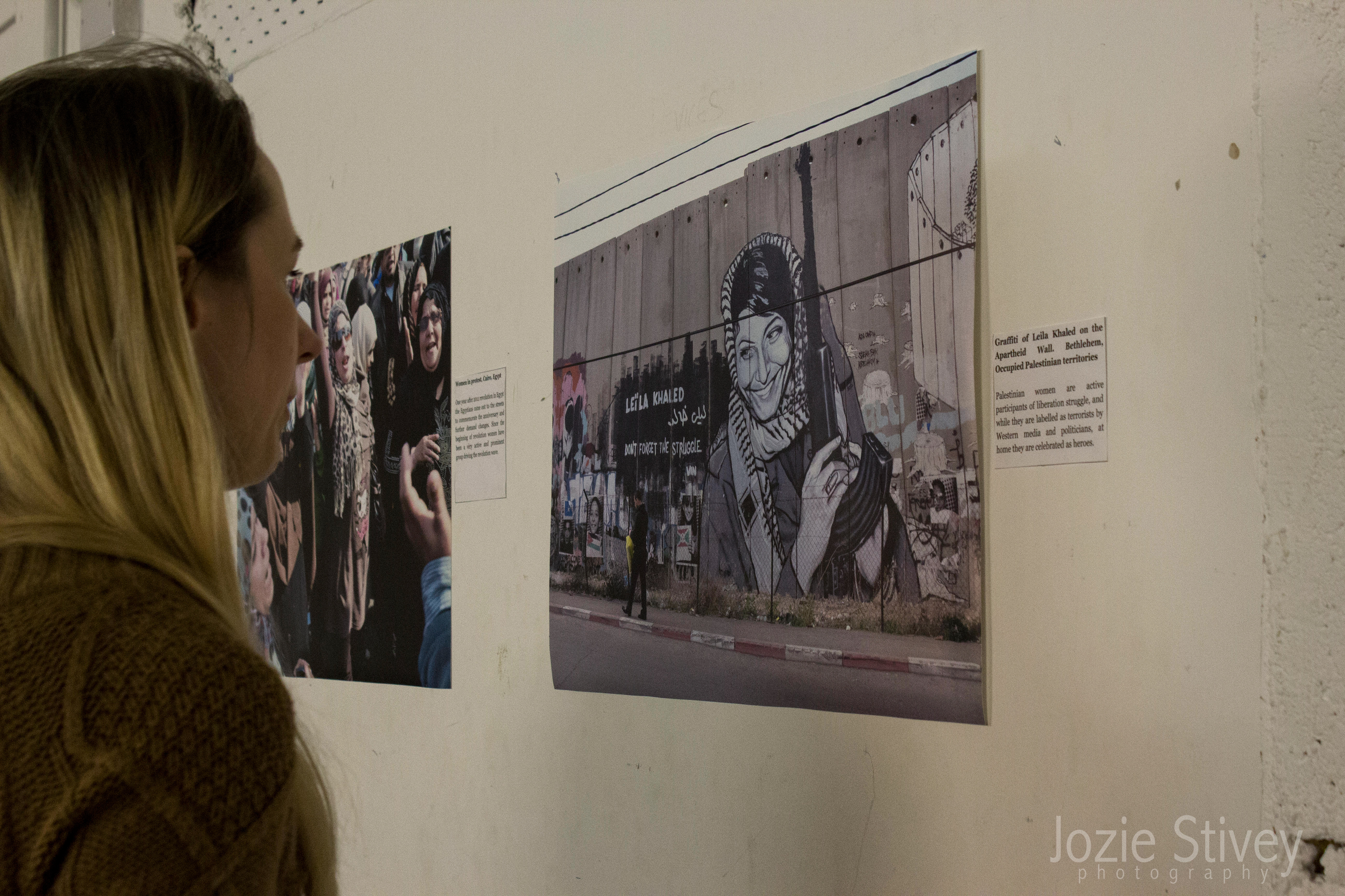
Taken by Jozie Stivey
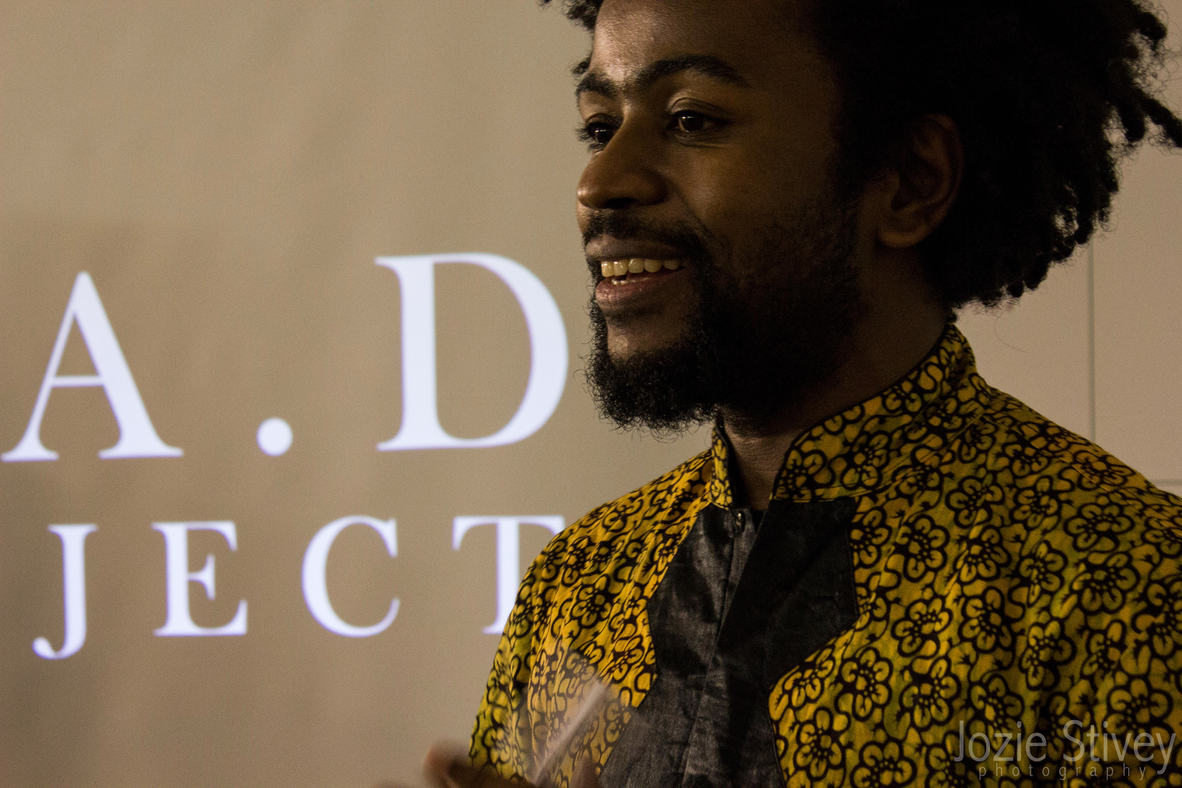
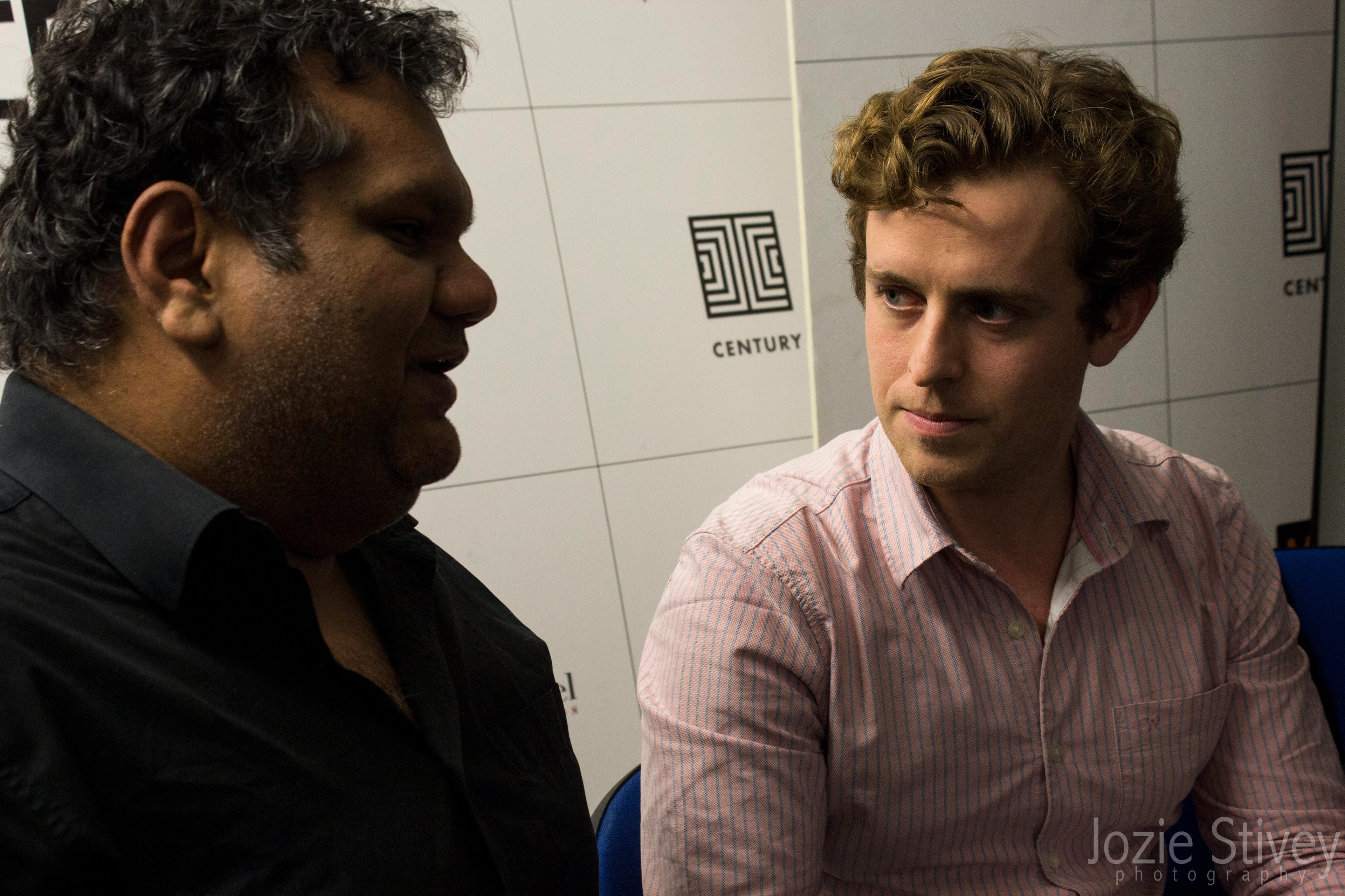
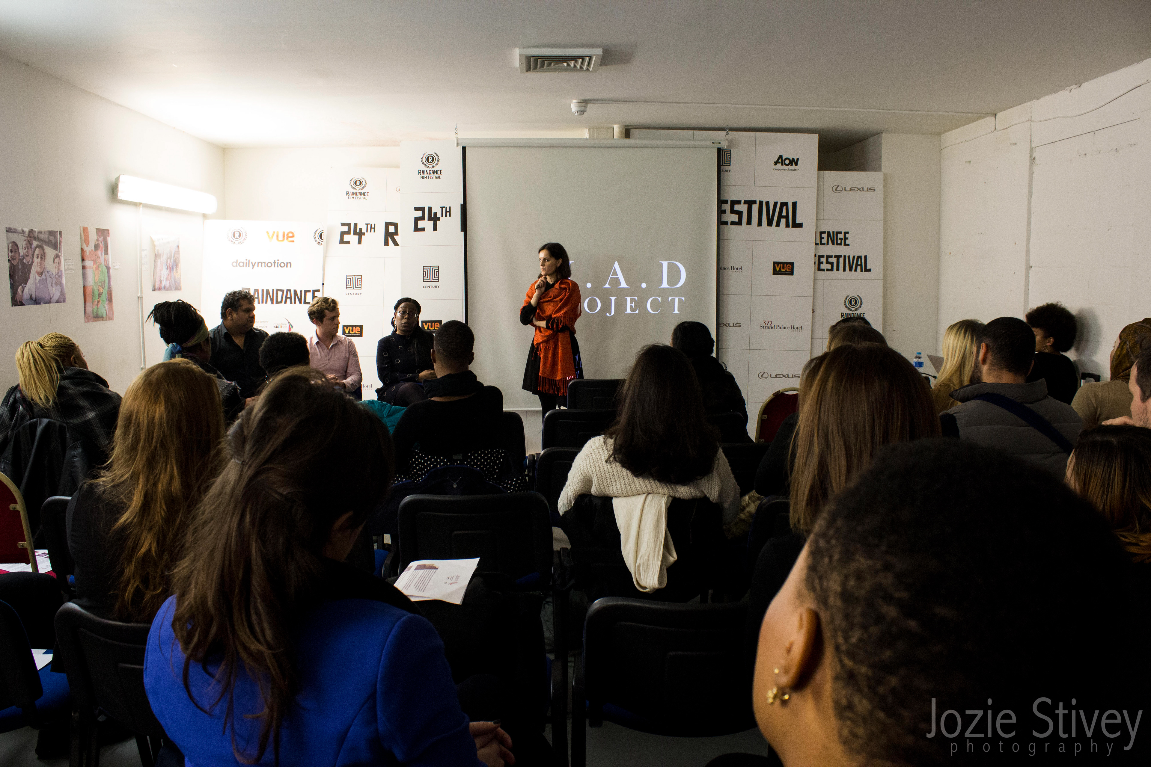
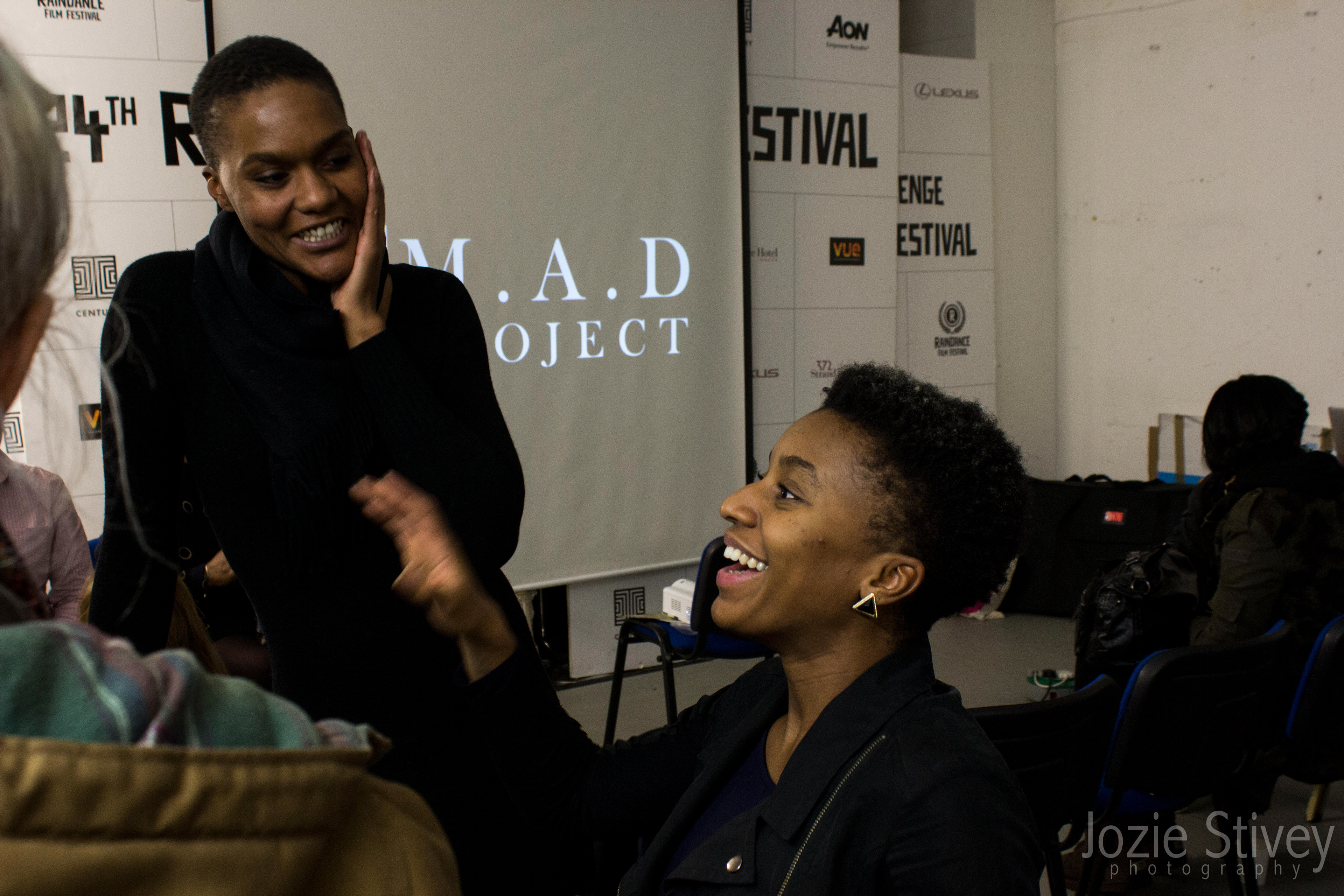
Taken by Jozie Stivey